Universal Pictures
- Universal Pictures is an American film production and distribution company
- Founded on April the 30th 1912, by German-American film producer Carl Laemmle, alongside with help from other film producers from England and America like David Horsley, Mark Dintenfass and Charles O. Baumann, and businessmen such as William Swanson and pat Powers, as well as Jules Brulatour and Adam Kessel as executives
- Universal Pictures is the oldest film studio in the United States, and the 5th oldest worldwide
- It's main headquarters is located in Universal city, California
- Over the years since 1912 til now, the famous film studio has changed it's well known logo multiple times
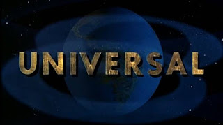
Starting with it's first logo: (1913-1914)

Although the film company was founded in 1912 only officially opened in 1915, their first film to be created was in 1914, which was called Damon and Pythias.
The first logo of Universal Pictures was to represent the planet Saturn. Hence the ring around the globe.
2nd logo: (1920-1922)
The only difference with this logo and the previous one is that the ring circling around the globe is now tilted to a diagonal side.

3rd logo: (1923-1926)

Clouds are also introduced into this logo as well
4th logo: (1927-1936)

There is no ring circling the globe
Earth is more clearer to see now
The clouds are less "messy" in a way in this logo
5th logo: (1936-1946)
This logo is much more vivid in what it's visualising to the audience
Only says "Universal"
6th logo: (1946-1963)
7th logo: (1963-1990)
The words "Universal" are much more bigger and wider and more zoomed into the whole picture
8th logo: (1990-1997)

The galaxy is shows very vividly as well as the earth's colours
Most recent logo: (now)
This logo introduces to the new or old audiences what Universal Pictures is about. The visual of the whole earth represents that "universal" theme the company simply goes for.
Universal Pictures 100th anniversary logo:
Universal Pictures has been hugely involved in movies like Despicable me 2, Lorax, Jurassic World, Minions, Furious 7, etc.
The Walt Disney Company
- A.K.A "Disney" worldwide
- Founders were Walt Disney and Roy O. Disney
- Walt Disney company was founded on the 16th of October 1923, in LA California
- The logo wasn't made until 1985, before the logo they would just write "Walt Disney presents" everywhere
- The castle in the logo is inspired by the Neuschwanstein castle in Bavaria
- Disney does own Pixar, since 2006, so they both are in partnership in some movies
- Disney's most famous movies like: Moana, Cinderella, Into The Woods, Toy Story, etc
Disney's first logo: (1927-1937)
After a lot of trouble occuring during the previous years before, Walt Disney finally released his first logo for Disney debuting in 1927

Disney's first logo showed the profile of Mickey Mouse.
When animated the logo would revolve and change colours.
(1937-1948):

This logo, it really questioned the artistic side of it. Questions were asked, if the "t" in Walt was a "y" or not
(1948-1979):

(1979-1983):

As well as adding in "Productions" after "Walt Disney" to make the logo's word mark more legible
(1983-1985):

(1985-2006):

It was placed on top of the name "Walt Disney", which it's style and lettering was not changed
(2006-2011):

The wording of "Walt Disney" was adjusted to be a bit smaller, just to fit underneath the board line of cinderella's castle
(2011-now):
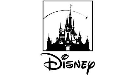
This showed more clearly and precisely to the audience of who "Disney" really is
Evolution of Disney's well known emblem:
Columbia Pictures
- American Film Production studio
- A member of the Sony pictures motion picture group
- Founded on the 10th of January 1924
- Founded in Los Angeles, California, USA
- Founded by Harry Cohn, Jack Cohn, and Joe Brandt
- First official logo was created in 1924 after the company was renamed
- Columbia Pictures most famous movies: The Shawshank redemption (1994), Spiderman-no way home (2021), Groundhog day (1993), Misery (1990), Ghostbusters (1984), etc
(1925-1926):

The emblem was now circular and the words were circled around the logo's border line
(1926-1932):

The black background and circular shape of the logo was not changed
Only the wording of the name "Columbia Pictures" was changed in it's font, size and shape
(1932-1933):

This logo was the first to have colour added into it
The red background of the lady holding the torch has white lines facing outwards of the torch, referring to the light's power from the torch
Hence the colour red being used on this logo, for the fire of the torch
(1933-1936):

The logo did not change much, just the colours and the placement of the lady holding the torch became more bigger in it's picture
(1936-1938):

The words were spread out to be bigger and bolder and more spacious
Clouds were added into the background of the lady holding her torch
The light's beams coming out of the lady's torch were more visual in this logo and more clearer of what it was
(1938-1945):

The lady was shown more vividly in this logo
She appears to be wearing a long gown
And the shape and size of the lady was spread out to be more bigger, which concludes to her torch going over the word placement of the letter "U"
(1945-1964):

They had added the name "Columbia pictures" to a label at the bottom of the lady holding the torch
The lady did look more smaller in her size due to the fact that the circular background was gone
(1964-1975):

Everything was changed compared to all the previous logos
The letter "C" was stylized and partnered up with the torch the lady was supposedly holding throughout the previous logos
(1975-1981):
Only the name "Columbia Pictures" were mentioned
The lady holding the torch was taken out
But the small black on top of the words were shown to be the torch shining in the dark
(1981-1989):

The wording was changed and placed at the bottom
The lady holding the torch was smaller a bit and the torch's light was expanded more bigger and was hovering over the lady standing
(1989-1992):

Now the Lady with a Torch is shown in thick black contours and placed on a white background
the rounded black image coming of the lady's torch is symbolised as a beam or rays
(1992-1993):

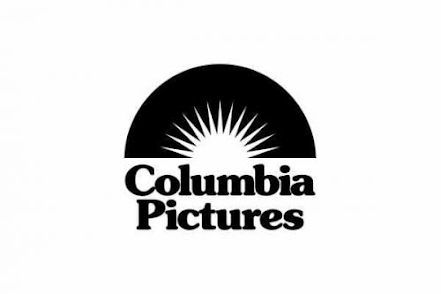
(1993-now):

Pixar
- American computer animation studio
- Founded on the 3rd of February 1986 by Steve Jobs, John Lasseter, Edwin Catmull and Alvy Ray Smith
- Walt Disney Studios now owns Pixar since 2006
- Headquarters is located in Emeryville California, USA
- Pixar hasn't really had much changes to it's logo but only 3 main big ones
- Pixar is very famous and well known for it's movies with Disney such as: Toy Story, The Incredibles, Ratatouille, Up, Finding Nemo, Wall-e, Inside Out, etc
(1979-1986):

The red and black emblem was supposedly made out to be a "pill"
Between the red and black sides, there is a white fine line running down in the middle of the other two colours
This logo was adopted in 1978, but officially broadcasted in 1979
(1986-1994):

The logo was then completely changed and redesigned
(1994-now):

Audiences notices a lot in the differences of the wordings shown in the letters "X" and "R"
The right bottom of the letter "X" is shown to be pointy and sharper than the rest of the letter, the same goes for the letter "R" as well
DTM logo (Group Production)
For our group production logo, it was created by Mackenzie Craig.
Watching this logo, we see that as the yellowy-orange fire on the right swirls in and becomes a mixture with the blue fire on the left, it creates a sort of illusion with it's circular motion. The music in the background comes in on the right timing and matches the same movements of the two fires combining. The two colours used are vividly shown on top of the black background which works successfully, nothing is too difficult to figure out when watching. Once the two fires swirl together and combine, it makes a small explosion afterwards. This is when it allows the word mark to be introduced. As "DTM" pops up, each letter individually stretches through from and outwards movement going in. The font of the letters works as well as the fires colours on top of the black backdrop. Even though the letters are in a black colour, the outlines of them are white, which makes it clear to read what it says when it is on a black back drop. "DTM" standing for our names, Deborah, Tiana and Mackenzie.
I personally like this logo because of the colours used and how good it mixes with each other, and for the type of emblem Mackenzie had used for our logo which was the fires.
For our preliminary tasks 1 & 2, we did not have the same logo/intros as each other, this was the first logo our group has created.
Comments
Post a Comment